Statistics for Data Science
The article elucidates the importance of statistics in the field of data science, wherein "Statistics" is imagined as a friend to a data scientist and their friendship is unraveled.


How many of us are involved in the act of taking "decisions" on a daily basis? Well, small or big the decisions may be, almost all of us take decisions on a daily basis. And we spend a significant amount of time and effort to get our decisions right. So why is this? What does taking a decision really mean? The art of decision making is just this – choosing a plan of action when faced with uncertainty. There are two ways to make a decision. One is the intuitive way, wherein one takes a decision out of a “gut feeling”. The other is the method that employs data or information. The former is purely a personal and artistic way of making a decision. But the latter is a logical and scientific way of arriving at the right approach with available data. This quantitative approach to decision making is the essence of Data Science. In this discussion, we are just going to see a flavour of this quantitative approach called “Statistics”.
Statistics and the Data Scientist
A Data Scientist is only as good as their questions. They should ask probing questions like:
- Does our money grow with our age?
- How much should I pay for this house?
- How is Google able to “guess” my search question?
Statistics is the art of connecting numbers to these questions so that the “answers” evolve! To establish quantitative connections to largely qualitative questions is the heart of statistics. I would like to state one of my favourite descriptions of a Data Scientist – “A Data Scientist is one who knows more statistics than a programmer and more programming than a statistician”. Data Science is that sweet spot that sits perfectly amidst computer programming, statistics and the domain on which the analysis is performed. Let us see how.

Statistics is a collection of principles and parameters for gaining information in order to make decisions when faced with uncertainty. When someone asks me, “What kind of statistics should I know to become a good Data Scientist?” I would say: “Please do not really worry about learning or knowing statistics for “data science”, but rather just learn statistics because it is actually the “art” of unraveling the secrets hidden inside the dataset”.
As a Data Scientist, we are solving a problem or helping someone to take a decision, based on the available data. So what do we do as Data Scientists to achieve this?
We define a problem statement (By asking the right questions)
- We then collect the right kind of data to perform our analysis
- We try to explore the data to see what it tells us
- We employ various techniques to derive inferences from the data or to predict some answers for the problem statement.
- Finally, we confirm that our inferences/predictions are fairly accurate (of course by scientific methods!)
To probe a little more on the “right kind” of questions and data, let us take an example. Let's say we are trying to answer a research question “How will the education landscape in the globe change in the next 30 years?”. Now to get an answer to this big question, we need to ask smaller questions like:
What is the current landscape of education around the world?
- What is the percentage of people who are completing high school or university?
- What are the latest trends in the Global job market and how is it going to impact the education field?
Then, we need to collect the appropriate data and information to answer these smaller questions. For example, to know the current landscape, we can collect data from UNESCO and UNICEF websites and we can use LinkedIn to collect some data on the latest trends in the job market. Please note that most of these datasets are available as open-source. Thus, defining a problem statement gives us clarity on how to approach and solve the “big” question in a methodical way.
To perform all of the above, the Data Scientist needs to have a fair idea of the domain in which the problem statement belongs. For example, if the Data Scientist is trying to answer the question “Why is this particular summer very harsh compared to the last 50 years?” they should have a fair idea about climate change and environmental science. Secondly, except for the first step, all the other steps involve dealing with a large amount of data in digital form. The data scientist should be able to get the data, cleanse it, read it, perform analytics, and employ methods to arrive at the answers, in a fairly short period of time. For this, they need to have skills in computer programming. All of the listed steps are not directly performed by the data scientist, but from a computer, instructed by a data scientist.
A Deep Dive into the world of Statistics

The word "Statistics" is derived from the Latin word "status", which refers to information related to a state or a province. It's actually said to be an ancient technique used by the kings to know the details about their state or province. So considering traditional statistics, it has three important parameters called MMM (Mean, Median and Mode). Fundamentally, all these three refer to one single aspect called the “Central Tendency”. The idea of central tendency is that there may be one single value that can possibly describe the data to the best extent. Let's look at this in a little more detail.
The Mean is not so mean after all!!
If you meet a person who truly practices communal harmony, equality for all and balance in life, would you call that person “Mean”? Unfortunately, this parameter is called the Mean! The mean, in simple terms, is the sum of the values divided by the total number of values.
(Note :Just try to read the below imagining as if “mean” would be a person and please don't hate me if you don't like the fairytale ! I will try a better one next time.)
Consider the below set of numbers,
{0 ,1, 1, 3, 3, 5, 5, 14}
In the above set, the number 4 is the mean. Now how did it become that? Something like this:
- Firstly, the number 4 sees that the right half of the set of numbers is having an "unfair advantage". So , it decides to even out this unfairness.
- It takes, "10 units " from 14 to ensure that the reminder i.e 4 , is somewhere in the “middle” ( between 3 & 5)
- “The mean” decides to distribute this “10 units” in a manner to even out all differences in the number set.
- It sees the weakest in the lot ( which is 0 ) , and “equalizes” that to itself. So, 0 becomes 4.
- Out of the remaining 6 units , it subsequently equalizes the “1s” to 4. Now, the number set looks like the below
{4, 4, 4, 3, 3, 5, 5, 4}
- Finally , “the mean” , again , picks “1 unit” , each from the 5s and gives it to the 3s.
- So, the final set thereby is {4, 4, 4 ,4, 4, 4, 4, 4} !!
That’s how “4” became the Mean. Harmony in equality! The mean is not mean at all! Thus , the mean is the number around which the whole data is spread out. However , mathematically , “the mean” is defined as the sum of all the numbers in a dataset , divided the count of numbers.
Do you want an alternative explanation? See this terrific resource.
The Median (The divider)
The median is the middle number when the numbers are in ascending order. So, here the median is 3 too. In any set, it is that number which exactly separates the higher half from the lower half (it’s helping divide and rule, probably, this should be named as “mean”). I earlier said that the mean is the number around which the whole dataset is spread around. But , the median is the number around which only the significant or relevant dataset is spread around. In the sense , the “median” will not be pulled by the outliers in the dataset. For example, in this case , the median is not affected by the 0 or the 14 , since the “significant range” is only from 1 to 5.
The Mode
Finally, we come to the most underused parameter, which is the mode. This is just the most frequently occurring number. In a set of {1, 1, 1, 1, 6, 8}, the mode is 1, but it’s not close to the average, which is 3.
If we compare mean vs median , neither of them are right or wrong, but we can pick one based on our situation and goals. Computing the median requires sorting the data and this may not be practical , if the dataset is large. On the other hand , the median will be more robust to outliers than the Mean, since the Mean will be pulled one way or the other if there are some very high magnitude outlier values (as explained earlier in the example).
Let's make a step further by introducing contemporary statistics, which is largely divided into three broad categories, as shown below:
- Descriptive Statistics (Representation of data)
- Inferential Statistic (Estimation or Prediction from sample)
- Probability Theory (Likelihood of occurrence an event)
Descriptive Statistics

As per the word, these methods describe the data to us in the form of tables and graphs. In the real sense, we are trying to explore the data to find out where the answer to the question lies.
We will see this in detail, with a case study. Let us say that we are working at a meteorology research lab and the data engineer has just provided us with a new dataset., We now need to explore this dataset and find out the details hidden in the dataset. In data science parlance, this step is known as exploratory data analysis (EDA). The first step is to read the data and get a flavour of the data (shown below are the code snippets for the same). The first line reads data into the R programming environment.
mydata = read.csv("C:/Users/AnandVasumathi/Documents/airquality.csv")
str(mydata)
[out]:
'data.frame': 153 obs. of 8 variables:
$ S.NO : int 1 2 3 4 5 6 7 8 9 10 ...
$ Ozone : int 41 36 12 18 NA 28 23 19 8 NA ...
$ Solar.R: int 190 118 149 313 NA NA 299 99 19 194 ...
$ Wind : num 7.4 8 12.6 11.5 14.3 14.9 8.6 13.8 20.1 8.6 ...
$ Temp : int 67 72 74 62 56 66 65 59 61 69 ...
$ Month : int 5 5 5 5 5 5 5 5 5 5 ...
$ Day : int 1 2 3 4 5 6 7 8 9 10 ...
$ Type : Factor w/ 2 levels "Pleasant","Warm": 1 1 1 1 1 1 1 1 1 1 ...
summary(mydata)
| S.NO | Ozone | Solar.R | Wind | Temp | Month | Day | Type |
|---|---|---|---|---|---|---|---|
| Min.: 1 | Min.: 1.00 | Min.: 7.00 | Min.:1.700 | Min.: 56.00 | Min. :5.000 | Min.: 1.0 | Pleasant:61 |
| 1st Qu.: 39 | 1st Qu.: 18.00 | 1st Qu.:115.8 | 1st Qu.: 7.400 | 1st Qu.:72.00 | 1st Qu.:6.000 | 1st Qu.: 8.0 | Warm:92 |
| Median : 77 | Median : 31.50 | Median :205 | Median : 9.700 | Median :79.00 | Median :7.000 | Median :16.0 | |
| Mean : 77 | Mean : 42.13 | Mean: 185.9 | Mean: 9.958 | Mean: 77.88 | Mean :6.993 | Mean: 15.8 | |
| 3rd Qu.:115 | 3rd Qu.: 63.25 | 3rd Qu.:258.8 | 3rd Qu.:11.500 | 3rd Qu.:85.00 | 3rd Qu.:8.000 | 3rd Qu.:23.0 | |
| Max.: 153 | Max.: 168 | Max.: 334 | Max.: 20.700 | Max.:97.00 | Max. :9.000 | Max.:31.0 | |
| NA's : 37 | NA's : 7 |
The str(mydata) statement tells us the structure of the data and the summary(mydata) gives us the summary. With the above, we can tell that this data is trying to describe some important parameters related to air pollution. If we pay closer attention to the second output, we see that the summary gives us some critical “numbers”, called mean, median, min, max, etc. which the statistical parameters (description of these were seen earlier). Ideally, this is the first step that any data scientist would perform. The catch is, real-world data would not look so clean up front and it may require some data cleansing before we can even get to this place!
A chart speaks a thousand words more than the data itself which has only 900 words!
Surprised with the title of this section? But yes, describing and presenting data in tabular form is not very effective as compared to representing the same data in the form of a chart/graph. Charting techniques are very important for a data scientist, in the sense that, these techniques are actually called data visualization techniques. This means the right kind of chart will give a powerful view into the data. Please see the post below, to get a feel of the power of Data Visualization
Let us dissect the dynamic chart in detail (This is one more quality a data scientist needs to have, dissection of information). You may have to Zoom in to see the below clearly.
- This is just a 12-sec animation, which has 200 charts embedded in it!!
- This animation shows the change in the economic landscape of the globe based on GDP data
- It starts with 1990 and then goes to the year 2000-2018, where, we the start of the rise of the BRIC countries
- From 2009 onwards, we see a steady rise of China.
- If we follow the complete spectrum, we can also see the change in some of the European countries.
So now, this was just a simple attempt from me to create a dynamic chart in R. But, if we pause at each half-second and observe closely, we get a thousand questions and insights.
- The steady rise of China, BRIC attributed to Globalisation?
- Positional changes in European Countries due to EU Policies?
- Fall of the Russian Federation due to the Russian revolution?
And a million more. Gosh, are we becoming Expert Economists here?
So again, I am reiterating the point on Domain + Coding + Statistics = Data Scientist.
Now, getting back to our original dataset, please see below.
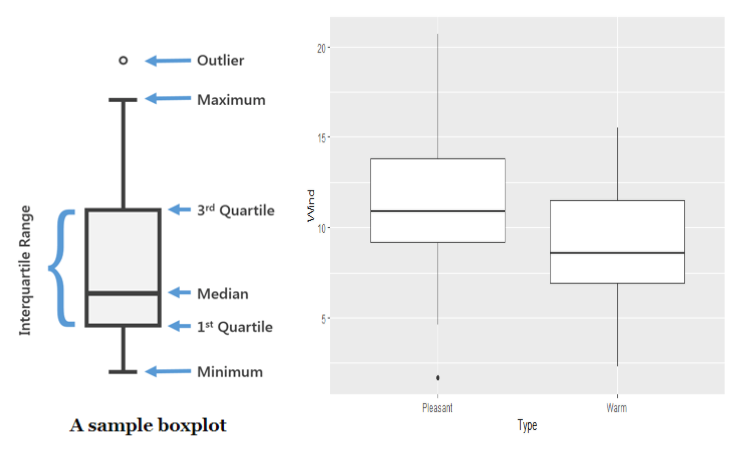
The above shown is called the box plot. Please note that we can use many types of plots to perform EDA, like scatterplot, histogram, which gives a very good visual representation of the data. However, box plot has an additional advantage that it displays all the statistical parameters like median, min, max, etc, very clearly. This chart does not only give a qualitative but also quantitative representation.
The left side of the figure is a sample to depict the parameters and the right side is the actual plot. “But wait, now how is this plot speaking 1000 words? This fairly looks mundane and boring!“ If this is what is running in your mind, hold on. If you observe closely, we can make out a few interesting findings (which are not obvious from the table given above the plot!)
- 75% of the values lie between ~9-14 (For Pleasant) and ~7-12 (For Warm). If we put these two subsets one over the other, we would get a significant overlap (the potential interquartile range) as 9 to 11 – That’s why the median (not mean) for both box plots are about 9-11 , since the median negates the outliers.
- The median line is not exactly in the middle of the box, so there is some skewness, but not much.
- The Whiskers (the lines connecting the outliers to the Interquartile range box)are pretty long (especially for the first one!), so this data has a lot of variances or standard deviation. So if we were to consider the mean, we would jump into all sorts of wrong conclusions. Take a peep at the value of “Solar.R” in the summary table!
Here's the code that I used to get the box plot Wind against Type
library(ggplot2)
m <- ggplot(mydata , aes(Type , Wind))
m+geom_boxplot()
Want to do dig in more? “Adulterate” the dataset with categorization
“Data variable in statistics are classified as Qualitative (how much) and Quantitative (how many). Further quantitative variables are classified as Discrete and Continuous” - Boring textbook stuff!! Let’s make this interesting.
If you see the graph, it plots Wind speed parameter against Temp! Yes, you read it right, Temp. But how is the x-axis just says "Pleasant" and "Warm"? (In case you missed this in the earlier section). That's because, I went into the data set and categorized the data, based on temperature. If the temperature on any day is more than 77 degrees, then it’s a warm day, else it’s pleasant. This was derived in a simple manner. If you look at the mean of the Temp variable, it is 77.8. I just came up with this heuristic (simply put, a sensible rule of thumb for convenience) and made the classification of “Pleasant” and “Warm” accordingly, in the dataset. This brings in an important concept of the type of variables. Fundamentally, the dataset can either have numbers, which are “continuous” or types/categories, which are “discrete”. Here, I created a new discrete variable because a good amount of data exploration can be performed only with a combination of discrete and continuous variables. In the below graph, we are plotting three variables at the same time (red dots are warm days and black dots are pleasant days).
with(mydata, plot(Wind, Ozone, col = Type))
abline(h = 75, lwd = 2, lty = 2)

Sampling in statistics

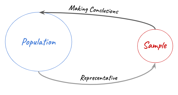
In the real world, data as such is a continuum i.e. it never ends. Though the advent of data science is all about dealing with huge sets of data, it is always a part of the whole. Therefore, samples are drawn in smart and efficient ways from the population so that they are an accurate representation of the whole population. For example in my dynamic chart, the underlying data is the GDP data of all the countries in the world, but do you think it will have 7 billion odd data points? Think again!
In statistics, sampling is extremely important. In one way, statistic itself refers to a particular parameter of a sample through which, we can make an estimation or prediction of the population. If you walk into an ice cream shop and see 99 varieties of ice creams, how would you decide which one to have for the day? Yeah, you would ask the vendor for a small spoon to taste before deciding your scoop right? That’s what sampling exactly means. There are various kinds of sampling and the ground rules for sampling is that, the statistics of the sample should be able to tell you about the population, as accurately as possible.
Here are some good ways to sample.
Simple Random Sampling

Every item in the population has an equal chance of being included in the sample. Random samples are usually fairly representative since they don't favour certain members.
Example: A coach writes down each players' names in their respective caps and chooses the players, without looking at them, to get a sample of players.
Why it is good: Random samples are usually fairly representative since they don't have bias towards any particular category.
Stratified Random Sampling

The population is first split into groups (stratum or layer). The overall sample consists of some items from every group. Then the items from each group are chosen randomly. A stratified sample guarantees that items from each group will be represented in the sample, so this sampling method is good when we want some items from every group.
Example: A student council surveys 100 students, consisting of 25 high school students, 25 undergrad students, 25 postgraduate students and 25 part-time students.
Why it is good: A stratified sample guarantees that members from each group will be represented in the sample, so this sampling method is good when we want some members from every group.
Cluster Random Sampling

The population is first split into groups or clusters. The overall sample consists of every item from some of the clusters. The groups are selected on a random basis.
A cluster sample gets every member from some of the groups, so it's good when each group reflects the population as a whole.
Example: An airline company wants to survey its customers. So they randomly select 10 flights on a day and then survey every passenger on each on of these flights.
Why it is good: A cluster sample gets every member from some of the groups, so it's good when each group reflects the population as a whole.
Also note that incorrect sampling methods will lead to skewed or biased results. To give a pretext with respect to machine learning, to train a particular machine learning algorithm, we take a sample data and train the algorithm based on the sample. In this case , the effectiveness of the machine learning algorithm fundamentally depends on the quality of the sample data. An incorrect type of sample (e.g. sample of convenience ) can result in incorrect predictions.
Inferential Statistics
This is actually statistical inference, wherein, we can make an inference about a large data set based on “testing” a small sample population of the data.
In practical situations, statistical inference can involve either estimating a population parameter or making decisions about the value of the parameter. The latter involves asking a “hypothetical” question about the data population and finding the answer by testing a small sample data.
A statistical test of hypothesis, consists of five parts
- The null hypothesis, denoted by $H_{0}$
- The alternate hypothesis, denoted by $H_{a}$
- The test statistic (a single number calculated from sample data) and its p-value (a probability calculated from test statistic)
- The rejection region
- The conclusion
The null and alternate hypothesis are competing and according to the statistical test performed, the data scientist has to reject one hypothesis. If you find this too difficult to follow, here's an amazing explanation from Cassie Kozyrkov.
So in this example, I would want to test to estimate the average Wind speed for the entire population i.e the entire dataset, by testing a sample i.e the data set for the month of May alone . Thus here, I am trying to estimate a parameter of the population using a test statistic on the sample. I run a statistical test (only for the 5th month) and get the below results. This test is called the one-tailed T-Test. This is a test where the critical area of distribution is one sided and we can tell whether the estimation is greater or lesser than the baseline (i.e Whether average of sample > average of Population? ).
First, I am checking the mean wind speed for the month of May. With this, I want to check my hypothesis that the mean wind speed for the entire population would be greater than 10. As shown below, in the orange box, I first check the sample mean. Then I perform a test called the one-tailed t-test.
data = subset(mydata , Month == 5)
mean(data$Wind)
[out]: [1] 11.62258
t.test(mydata$Wind, mu=10, alternative="less", conf.level=0.99)
[out]:
One Sample t-test

data: mydata$Wind
t = -0.14916, df = 152, p-value = 0.4408
alternative hypothesis: true mean is less than 10
99 percent confidence interval:
   -Inf 10.62716
sample estimates:
mean of x
   9.957516
From the output, we can see that the mean Wind speed for the sample is 11.622 ( In the orange box) . If we see the subsequent green box below ,the one-sided 99% confidence interval tells us that the mean of wind speed is likely to be less than 10.62 i.e we can say that mean will be less than 10.62 with a very high degree of confidence. The p-value of 0.4408 tells us that if the mean wind speed was 10, the probability of selecting a sample with a mean wind speed less than or equal to 10 would be approximately 44 %. To put simply , this p-value indicates to us that though the mean of the sample is 11.622 , the mean of the population may only be close to 10.
Since the p-value is not less than the significance level of 0.01, we cannot reject the null hypothesis that the mean wind speed is equal to 10. This would also mean that there is not enough evidence to comment on the average wind speed, based on the test. However , we have a few inferences from the output of the test.
There are largely two kinds of problems, which we will usually try to solve using inferential statistics. One is the previous type, wherein we try to answer a question, by testing a hypothesis. The other is to estimate or predict an outcome, using the sample. A popular technique for this requirement is called regression. With the same data set, if you see below, I have tried to depict a model by which I would be able to predict the Temperature at any given point. The model that is built is a linear regression model. I have just plotted Temp vs. Day, and in the resulting scatter plot, I have tried to fit a straight line. Simple! However, in the below plot, the red line is called the line of best fit. This means, given this scatter plot (badly scattered!), this is the best linear model (Simply, a straight line) that I could fit. It's obvious that my predictions based on this model not be very accurate. To address this, we have non-linear regressions and many other predictive modelling techniques, with which we can make much better predictions. (There is more math to all of this, but let’s keep it for the next section). But one small food for thought. This line is almost falling in the range of the median. So why can’t we just draw a straight line around the average value? Hmmm... No. If you see, though this line is not the best predictive model, its “slanted”, which hints us on the Trend. This line kind of tells us that, the temperature usually drops as the months progress. That’s why these lines are also called the Trend lines.
t.test(Solar.R~Type , data = subset(mydata , Month == 5))
x<- mydata$Day
y2 <- mydata$Temp
## Application of Linear Regression
model <- lm(y2~x) ## lm standards for linear model
windows(7,4)
plot(x,y2,xlab="Day",ylab="Temperature - in deg F",pch=21,col="blue",bg="red")
abline(model,col="red")

So great, we have actually put some “science” in our data and have unraveled some interesting facts in the data. The Science here is statistics.
Conclusion
What we have seen in this article is just the tip of the iceberg. The next level is where statistics is used to predict outcomes and that is when we enter the exciting world of “Machine Learning”. Similar to how we arrived at the concept of “continuous” and “discrete” earlier in this section, these prediction techniques too largely fall into two categories, where the continuous styled are called regression techniques and the discrete styled are called classification techniques. We already saw a teaser for this, in the last part of the previous section.
Until now, we have used the past data to understand, infer and predict the future. Great! But, what is the guarantee that history will repeat itself? To deal with this, we need to understand another important topic called Probability theory, which talks about the likelihood of an event occurring. So it’s not only important that what happened in the past, but also how likely is it to get repeated in the future! Also, there is a special theory called the Bayesian theory, wherein the past probabilities can be reversed if additional information is provided. We will see this in detail in the next discussion. So interesting times ahead!
A prelude to Machine Learning
As discussed in the first section, we as data scientists are performing all these heavy-lifting of data, by instructing computers. We can instruct the computers, but not for ever! At some point, the machines need to start learning for themselves, right? Yeah! You got the hang of it! So the art of teaching the machines to learn from past data, their statistics and the probabilities of the recurrence, is known as Machine Learning. Actually, for humans, it’s Machine teaching (because we are teaching the machines to learn!). And what more, if the machines can learn exactly the way the human brain does, then it is even special (Deep Learning), because humans are the smartest on this planet. Don't worry, the machines will not overtake us, as long as we continue our learning!

We will see that in the upcoming discussions. So, Statistics for Data Science? Well, Statistics is Data Science.
Resource from where you can learn Statistics and Data Science
Here are some useful resources from where starting your journey.
Books:
- Freedman.D.,Pisani.R.,Purves.R.,(2007). Statistics.4th Edition.W.W.Norton & Co.
- Crawley, M. J.(2013) The R Book. 2nd Edition. John Wiley & Sons.
- James.G., Witten.D, Hastie.T.,Tibshirani.R.,(2017) An Introduction to Statistical Learning , with Applications in R . 2nd Edition. Springer.
Online Resources:
- For all Data Science related topics , see http://datasciencemasters.org/
- For advanced statistics , see https://statstuff.com/
- This is probably one of the best blog about Data Science and ML, I strongly recommend you to check it out: https://brohrer.github.io/blog.html
- I suggest you even to check the terrific articles of Cassie both on HackerNoon and TowardsDataScience
FloydHub Call for AI writers
Want to write amazing articles like Anand and play your role in the long road to Artificial General Intelligence? We are looking for passionate writers, to build the world's best blog for practical applications of groundbreaking A.I. techniques. FloydHub has a large reach within the AI community and with your help, we can inspire the next wave of AI. Apply now and join the crew!
About the Anand Venkataraman
Anand is in eternal love with the art of storytelling with data. He is a passionate data science trainer, researcher and student for life. He lives by the motto "I am not a professional who is learning, I am a student who is holding a full-time job to earn a living.'' He likes to explore innovative teaching methods and tries to employ the "Feynman's technique", wherein, he tries to explain complex concepts in simple, effective and innovative methods. His dream is to teach Data Science and Mathematics to school kids and help them find expression for their passion. Anand is also a FloydHub AI Writer. You can connect with Anand via LinkedIn.